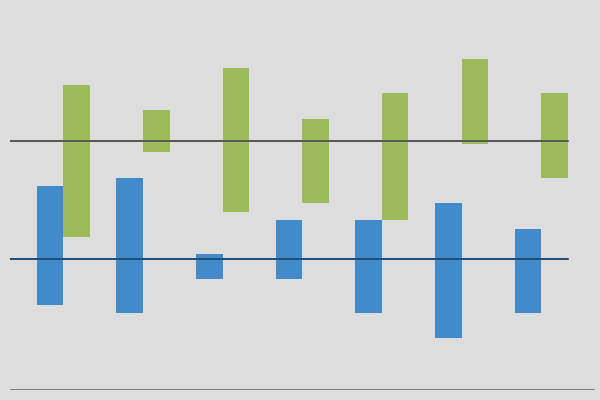
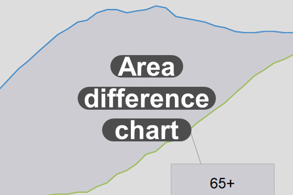
Cart  Purchase History
Skip to content
Excel Effects

Excel Effects

Excel charts, dashboards, templates, tools, and games

  • Home
  • Software
  • Education
  • Games
  • About
  • Contact

Chart library

Area difference chart

Posted on October 26, 2019September 19, 2020 by Excel Effects
Area difference chart

So, the area difference chart is kind of an unique graph. Generally, it compares two similar items and shades in the area of difference. Also, notice that this is just a stacked area chart with two lines. That is the so-called trick. Requirements Excel 2007 or higher or compatible. Download

Learn More
Chart library

Bar with average line chart

Posted on October 26, 2019September 19, 2020 by Excel Effects
Bar with average line chart

In a bar with average line chart, the categories are shown from top to bottom or vice versa. Overall, it is not that difficult to create. However, when you try to add an average line, that is when things get tricky. Also, notice how we have the categories in descending order. Now, if we were […]

Learn More
Chart library

Basic Column Chart

Posted on October 26, 2019September 2, 2020 by Excel Effects
Basic Column Chart

In short, the basic column chart is a very common graph. Basically, it compares data across various categories. And, the data is shown through vertical bars of various heights. Basically, the data you use to design a column graph normally comes in the form of numbers or percentages. Although this is a simple chart, you […]

Learn More
Chart library

Bubble Chart

Posted on October 26, 2019September 19, 2020 by Excel Effects
Bubble Chart

Of course, there will be times when you will need a bubble chart to compare data. In short, this type of chart is good if you want to use a size component. Therefore, the different sizes and positions help you compare the categories. On the whole, all you need to do is specify the horizontal […]

Learn More
Chart library

Butterfly Chart or Tornado Chart

Posted on October 26, 2019September 19, 2020 by Excel Effects
Butterfly Chart or Tornado Chart

For one thing, this butterfly chart is perhaps one of the most fun graphs to look at. Basically, this graph compares two opposing groups within the same category. On the whole, it is so much fun, allowing you to compare teams, election results, or anything pertaining to a competition or race. So, you want to […]

Learn More
Chart library

Clustered Column Chart on Two Axes

Posted on November 4, 2019September 7, 2020 by Excel Effects
Clustered Column Chart on Two Axes

On the whole, many types of companies find the clustered column chart very useful. In fact, it is a very common chart. However, this graph is slightly different. You see, it has one bar on the primary side. And, the other bar is on the secondary side. If you look at both scales, then you […]

Learn More
Chart library

Clustered High Low Chart for Excel

Posted on November 23, 2019September 19, 2020 by Excel Effects
Clustered High Low Chart for Excel

A clustered high-low chart compares a high and low values. Now, you can also adjust the color based on a positive or negative change. Of course, you want to make that automatic. Right now, you cannot tell if it started off high or ended low. At the bottom, the labels are text box links. However, […]

Learn More
Chart library

Clustered high low with average lines chart

Posted on September 7, 2020September 19, 2020 by Excel Effects

By now, you have seen the clustered high-low chart. And, it is amazing. Well, this chart takes it to another level. Meaning, we include average lines for each series. And, these lines are actually trend lines of the original average lines. Therefore, this allows us to extend the line to the edge. Otherwise, we would […]

Learn More
Chart library

Clustered Stacked Column Chart for Excel

Posted on November 23, 2019September 19, 2020 by Excel Effects
Clustered Stacked Column Chart for Excel

Clustered stacked column chart overview The clustered stacked column chart puts two columns together, which forms a cluster. In this case, we have two stacked columns. This allows us to compare data with the same descriptions across multiple categories. Download You need Excel 2007 or higher or compatible to use this chart. Click on the […]

Learn More
Chart library

Column and scatter line chart for Excel

Posted on November 23, 2019September 19, 2020 by Excel Effects
Column and scatter line chart for Excel

In some cases, people refer to a column and scatter line chart as a price-volume chart. However, there is generally an equal number of columns to line values in a price-volume chart. Download the column and scatter line chart Requirements You need Excel 2007 or higher or compatible to use this chart. Download

Learn More
Chart library

Posts navigation

Older Posts
Excel Effects Home Return to Top

Development Category (English)300x250

Artplotty Grid


  • Home
  • Software
  • Education
  • Games
  • About
  • Contact
Software

Online apps

Chart library

Real data charts

Dashboards

Templates

Vintage

All software

Education

All education

Games

Bubble Dip Match

Wingding Match

All games

The social stuff


Designed and programmed by: Excel Effects

© Copyright 2020. All rights reserved. Privacy policy  Software agreement