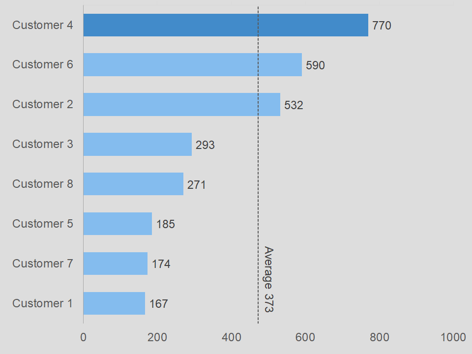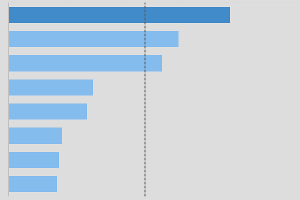
Bar with average line chart for Excel.
Overview of bar with average line chart for Excel
In many businesses, the bar chart is very common. However, you may not see an average line with these charts. But, financial firms may use this chart often. Therefore, it you will want to have this chart in your library.
So, instead of a chart working from top to bottom, this chart works from left to right.
Now, the tricky part about doing this type of graph is how you organize the data on the sheet. It is as if you have to organize the data backwards. For example, it normally makes sense to start with Customer 1 and work your way up. However, in this chart you can start with Customer 4 and work your way up.
In all actuality, it does not matter because if you know how to reverse the order of the axis in the chart, then you can enter the data in either direction.
Hopefully, that made sense. If not, then realize, the chart is already made for you. And, all you have to do is update the data, for the most part.
The vertical line
The vertical represents the average of all the bars. As for my developers out there, this line is actually a trend line from another series in the chart. Do not worry, it is hiding from you. Possibly, we will be able to show you how we did that.
Download the bar with average line chart
If you want this chart, then click on the button below to download it.
As you may know, charts help you show data and information to your audience in a more visual manner. In addition, it tends to keep the attention of your client. So, you can also learn how to create a chart from scratch. This way, you will have a better understanding of the process for creating a chart.
There are various apps that allow you to create charts. Of course, Microsoft Excel is a very popular app for working with charts. However, you can use Google Sheets, Apache OpenOffice, or LibreOffice to create charts. For the most part, they are compatible with Excel.


