Bar high low average line chart for Excel

Bar high low average line chart for Excel

Bar high low average line chart for Excel

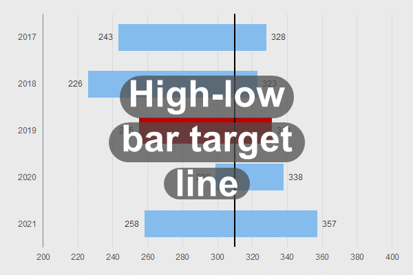
Bar high low average line chart overview

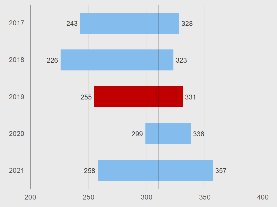
So, the bar high low average line chart is very similar to our regular bar high-low chart. You can visit that page to learn more about the chart itself. The only difference is the average line, which is actually a trendline. One day, maybe in a tutorial, we will explain that method.

Requirements

Microsoft Excel 2007 or higher or compatible.

Download


Chart library  Excel Effects home


Charts

As you may know, charts help you show data and information to your audience in a more visual manner. In addition, it tends to keep the attention of your client. So, you can also learn how to create a chart from scratch. This way, you will have a better understanding of the process for creating a chart. There are various apps that allow you to create charts. Of course, Microsoft Excel is a very popular app for working with charts. However, you can use Google SheetsApache OpenOffice, or LibreOffice to create charts. For the most part, they are compatible with Excel.