Clustered high low chart with average line for Excel
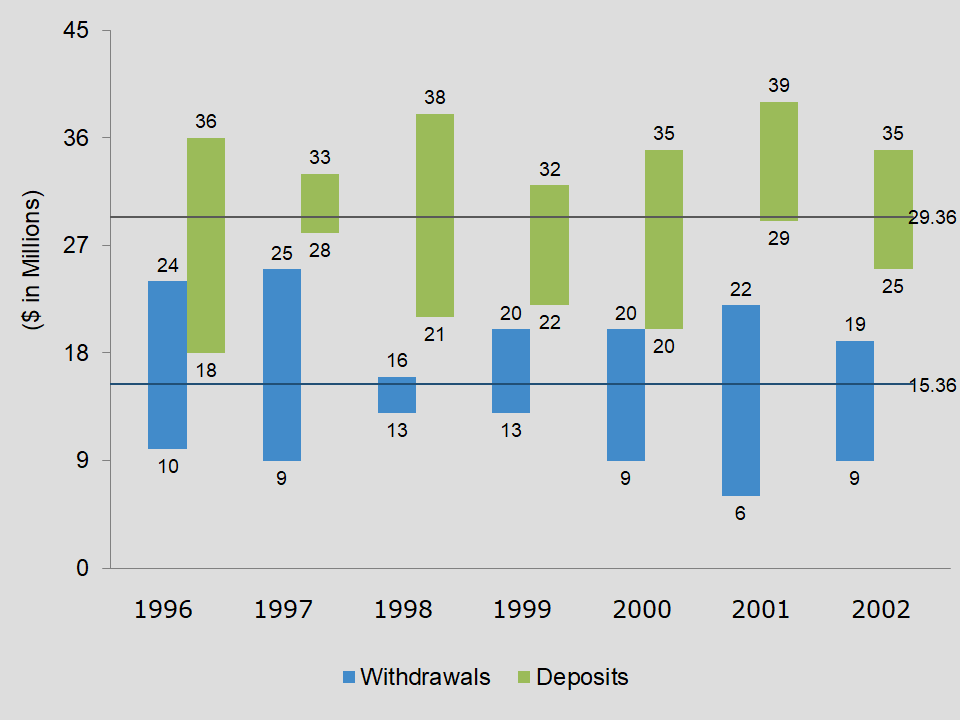
The clustered high low chart with average line for Excel has two average lines. And, both lines stretch across the entire series.
Requirements
Microsoft Excel 2007 or higher or compatible.
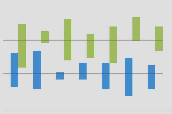
The clustered high low chart with average line for Excel has two average lines. And, both lines stretch across the entire series.
Microsoft Excel 2007 or higher or compatible.
Want to see everything, well almost everything on Excel Effects?
How-to guides Charting Excel PowerPoint Quick tips Quiz Snapshots VBA Videos Google courses Python courses Question of the day Tech Tuesday
Chart library Area charts Bar charts Bubble charts Column charts Combo charts Donut charts Line charts Math charts Pie charts Scatter charts Sheet charts Special charts
Excel Effects filing and organizational tools for your digital office needs.
Yearly calendar Monthly calendar Project schedule template Templates


Affiliate stuff – Move up and excel with Excel


