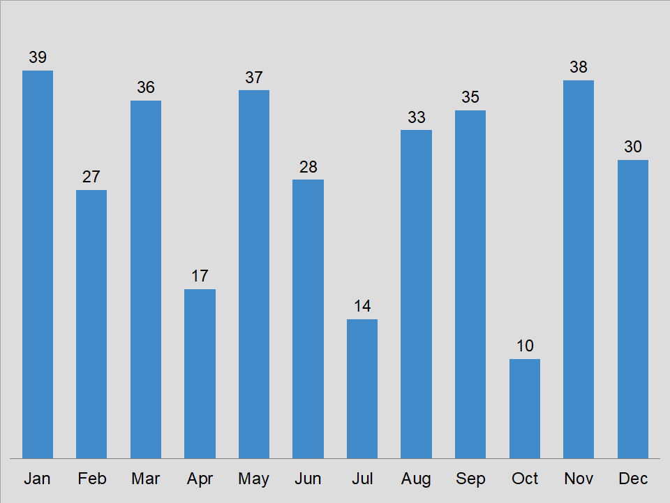
The clustered column chart.
Overview of the clustered column chart
The clustered column chart is perhaps the most widely used chart in business. In general, it has a basic appearance. However, you get an excellent visual of your data in a very simple form.
Some like to compare this graph to a pie chart due to its simple form. But, with this type of graph, you can display over six categories and it does not look cluttered. That is one of the key aspects of this chart that we like.
Moreover, you can put additional columns next to each other. Thus, comparing multiple data series. Now, isn’t that great? This way, you can see which data group is performing better. Again, it is all about making it easier to analyze data. In most cases, once you get your column chart working good, you can relax.
Download
If you would like to download the clustered column chart, then click on the button below.
As you may know, charts help you show data and information to your audience in a more visual manner. In addition, it tends to keep the attention of your client. So, you can also learn how to create a chart from scratch. This way, you will have a better understanding of the process for creating a chart.
There are various apps that allow you to create charts. Of course, Microsoft Excel is a very popular app for working with charts. However, you can use Google Sheets, Apache OpenOffice, or LibreOffice to create charts. For the most part, they are compatible with Excel.