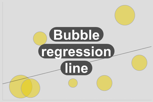
The bubble chart with trend line.
The bubble chart with trend line
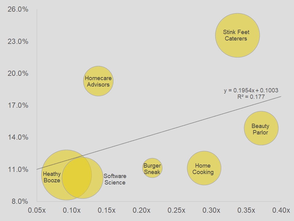
In the past, bubble charts got on my first and last nerve. Perhaps, it was due to the kind of bubble graphs that I had to work with. Mostly, these graphs had like hundreds of bubbles in it. Moreover, each time someone added new data, you had to make manual adjustments to the graph.
Fortunately, with new updates to the app, it became easier to work with the chart. So, in any case, this chart that we have for you is not too bad. Of course, if you start messing around with two many bubbles, something may burst.
In addition, we also have a trend line in the chart, which we find common in this type of graph. It is a basic linear line that you can adjust. Moreover, we added the equation of the line in there. Remember that in statistics? Bearly.
Download
If you want the bubble chart, then click on the button below to download it.
As you may know, charts help you show data and information to your audience in a more visual manner. In addition, it tends to keep the attention of your client. So, you can also learn how to create a chart from scratch. This way, you will have a better understanding of the process for creating a chart.
There are various apps that allow you to create charts. Of course, Microsoft Excel is a very popular app for working with charts. However, you can use Google Sheets, Apache OpenOffice, or LibreOffice to create charts. For the most part, they are compatible with Excel.