Bar chart with average line (2nd version)

Bar chart with average line (2nd version)

Bar with average line chart (2nd version)

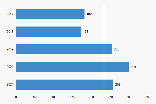
Bar chart with average line for Excel

In the second version of the bar with average line chart, we use a different method for plotting the average line. Instead of putting another series on the secondary axis, we use a trendline to create a vertical line, from top to bottom.

Keep in mind, it takes a little work to make that happen too. However, you will not have to worry about messing with the secondary axes.

Download


Related


Chart library  Excel Effects home


As you may know, charts help you show data and information to your audience in a more visual manner. In addition, it tends to keep the attention of your client. So, you can also learn how to create a chart from scratch. This way, you will have a better understanding of the process for creating a chart. There are various apps that allow you to create charts. Of course, Microsoft Excel is a very popular app for working with charts. However, you can use Google SheetsApache OpenOffice, or LibreOffice to create charts. For the most part, they are compatible with Excel.