Our data visualization examples show you different and creative ways you can show information to your audience.
Creative data visualization
GendPop examples
These examples show you how you can use GendPop to creatively display information. With GendPop, you get to save your creative chart as a SVG file. Meaning, you can open it in almost any app.
We like to use our GendPop charts in PowerPoint. Overall, it enhances our presentations. Plus, it allows us to add more design elements to our analysis.
Example 1
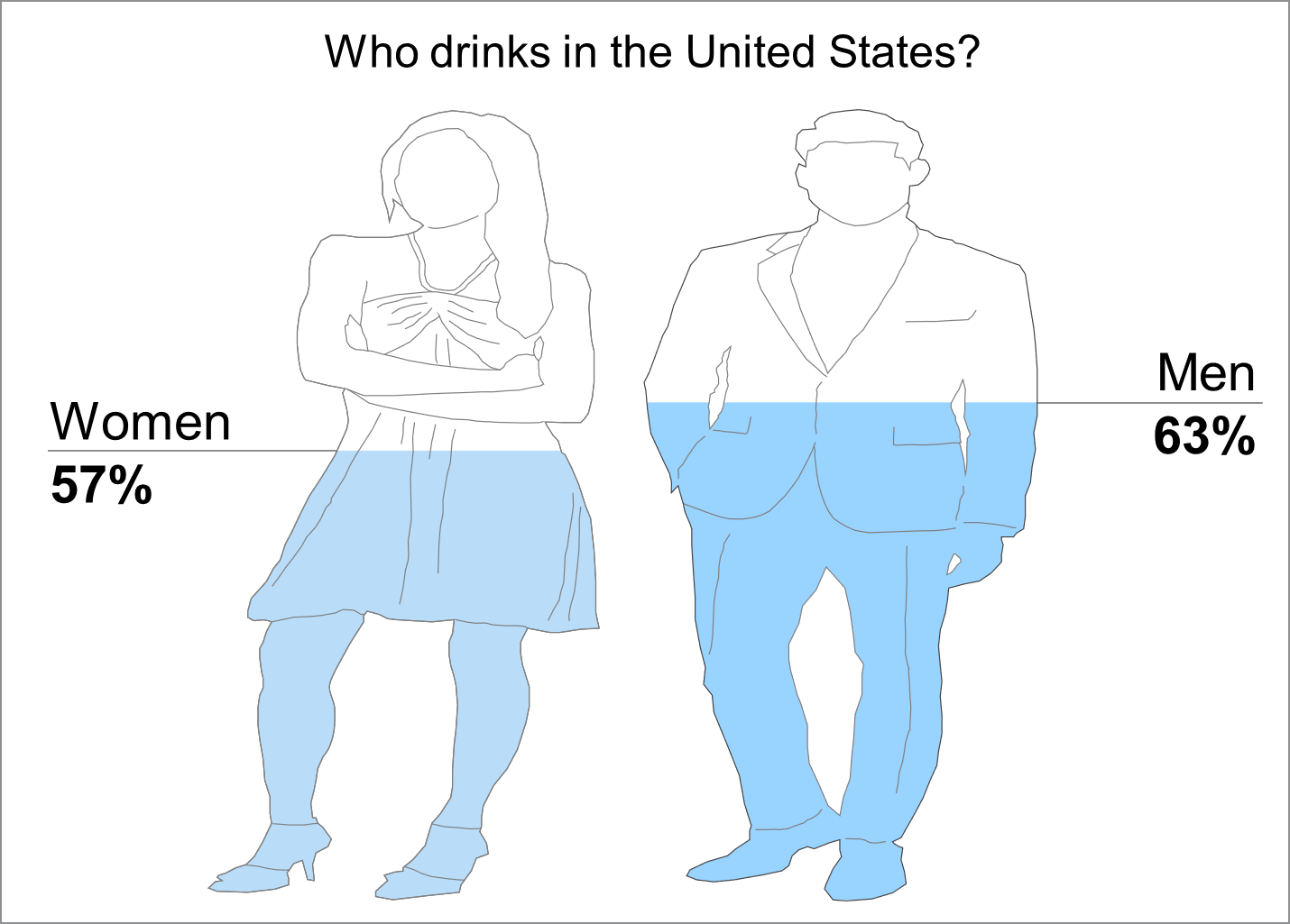
Instead of using a basic pie chart to compare gender-based info, you can use GendPop. Of course, you may need to use some of your other creative juices to make it pop even more.
Example 2
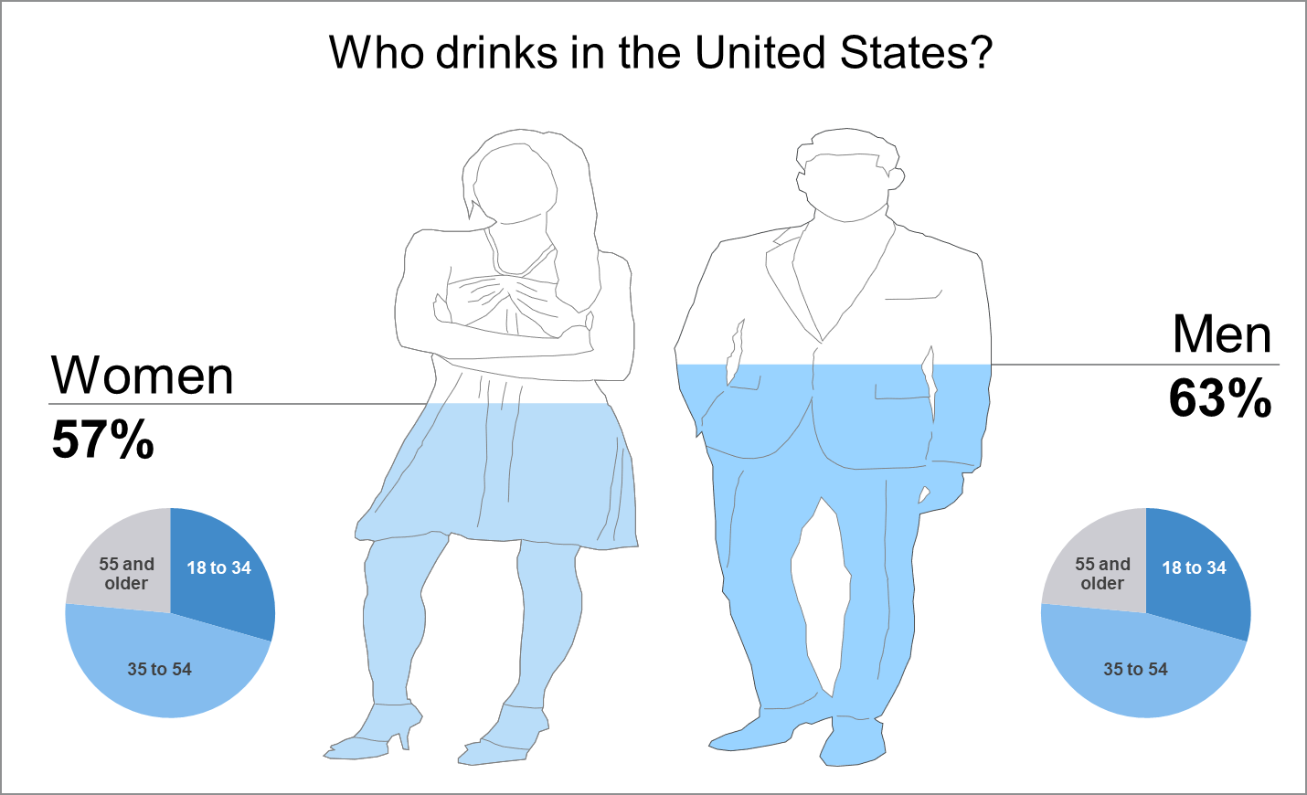
So, this example is very similar to example 1. However, notice how we include some pie charts in the design. Overall, you can really do some great stuff with GendPop.
Example 3
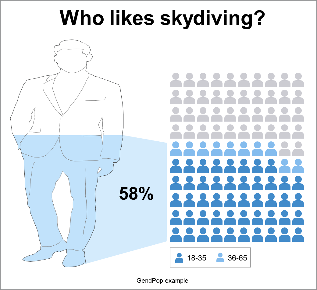
Of course, you can use GendPop with other apps to create an analysis. The above example shows the percent of men who like skydiving. This data is all fake, and just an example.