Who drinks in the United States by gender?
These data visualization examples show various ways to depict who drinks in the United States by gender.
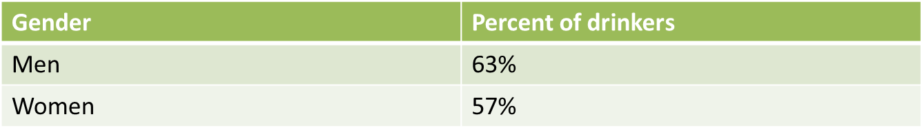
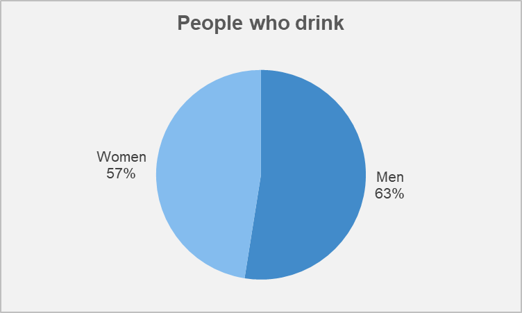
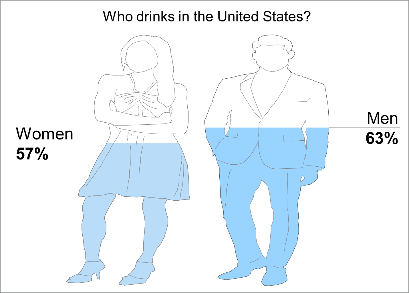
According to data from Gallup.com, 63% of men drink, and 57% of women drink. The poll was taken from July 6-21, 2021. So, with this data, we will show the comparison between 63% and 57% in three ways.
Examples
Here are some examples of how you can show the above information in a more creative way.
Example 1 – A table
Firstly, we show this data in table form, which is great. It looks good.
Example 2 – A pie chart
Secondly, we show this data with a pie chart. This looks good too.
Example 3 – Using GendPop
Finally, we show you an example using GendPop. Now, this is kind of fancy.
So, the good part about GendPop is that you can add pie charts, tables, and other elements to it. Thus, in the below example, we add pie charts.
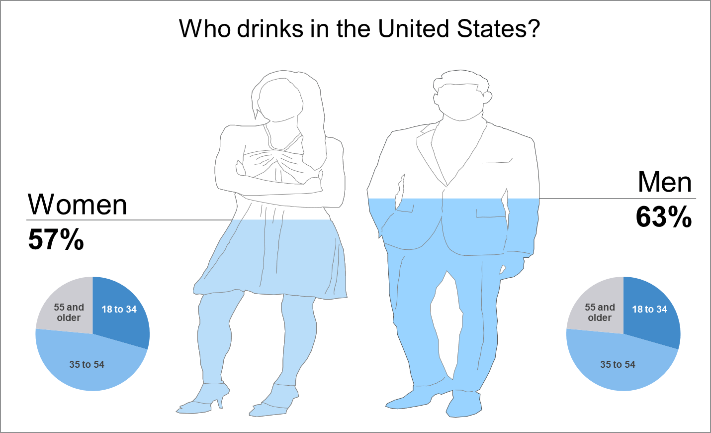
Note: The pie charts in the above diagram contains fake data.
All in all, GendPop allows you to add that extra pop to your analysis. Just do not overdo it.
Give it a shot!
Now it is your turn to analyze data with GendPop. It is easy, quick, and fun.
Show us what you can do.