The butterfly chart.
Overview of the butterfly chart
So, before you say, that is a tornado chart, or a football chart, yes, we know about the alternative names too. However, we like the name butterfly the best. On the whole, it sounds better than the other two options.
If you create this chart right and the data works for you, then, your graph will look like a butterfly. And, for you tornado lovers, it will look like a tornado too, with an upside down funnel shape. Now, if that is the case, then you will probably sweep your audience right off their feetsies.
Fly butterfly fly, up up to the sky!
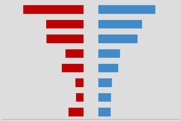
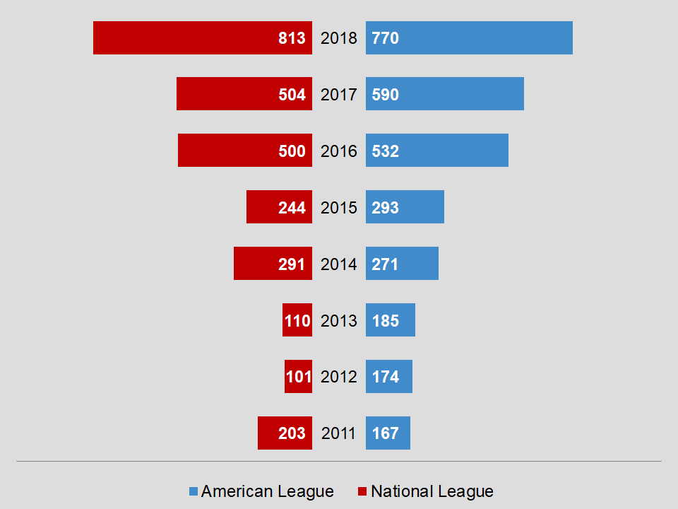
With this chart, you are comparing two values. Although we used a red value for the left side, that does not necessarily mean negative. You can make it any color you choose. In the example above, we are comparing some numbers from baseball. Of course, they are fake numbers for this purpose.
Download
If you want to download the butterfly chart, then click on the button below.
As you may know, charts help you show data and information to your audience in a more visual manner. In addition, it tends to keep the attention of your client. So, you can also learn how to create a chart from scratch. This way, you will have a better understanding of the process for creating a chart.
There are various apps that allow you to create charts. Of course, Microsoft Excel is a very popular app for working with charts. However, you can use Google Sheets, Apache OpenOffice, or LibreOffice to create charts. For the most part, they are compatible with Excel.