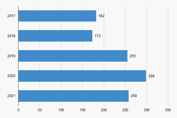
Standard bar chart for Excel
The standard bar chart for Excel is a very common chart that people use in all types of businesses. Overall, there is not too much to this graph. All you have to do is enter your categories and your values and watch it go to work.
Now, the only thing to this graph is, when you enter the data and generate the chart, the y-scale shows the categories in the opposite order. For example, when we first generated the above chart, the first category was 2021, as oppposed to 2017. In the sheet, the first category is 2017.
Therefore, you may have to manipulate the chart to display the order you like. Maybe, we will get a chance to do a tutorial on it.