
How to put average line on a bar chart in Excel
This quick tip shows you how to put average line on a bar chart in Excel.
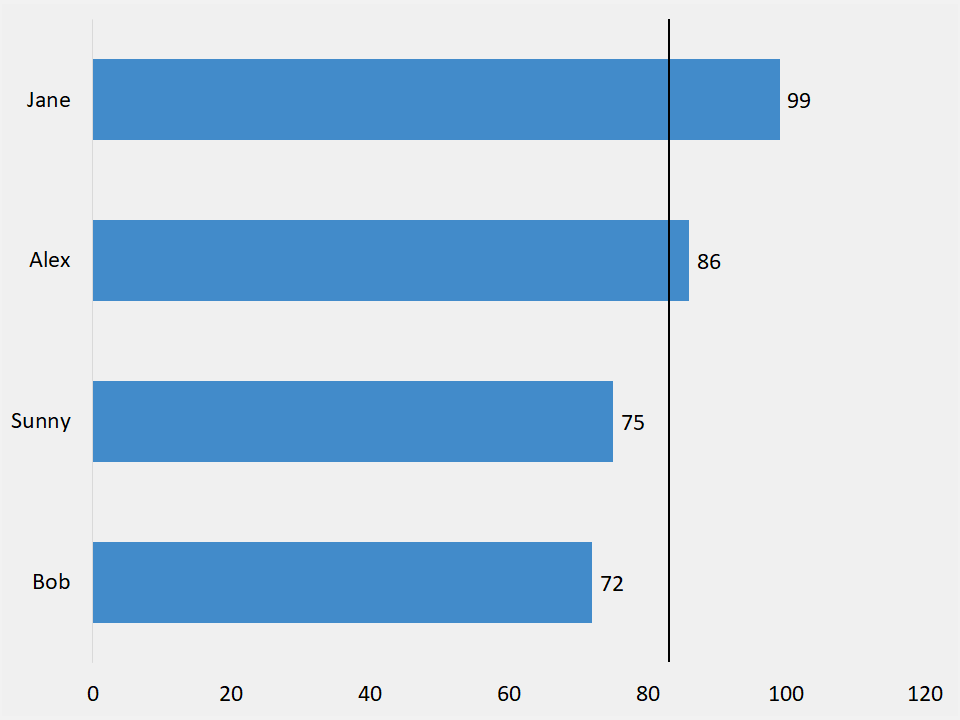
Set target goal
So, you may hear people say “target line” for this type of chart. For the most part, it is the same idea. Except, we use the term average as a measuring statistic. In addition, it could represent the median, or a goal you set yourself.
Short video
Below is the short video on putting an average line on a bar chart in Excel. No extreme fancy tricks either. Also, you may need to maximize the video, to get the full effect of this quick tip.
Download
If you want to download this type of chart, then visit the page listed below.
Bar chart with average mark (2nd version)