
How to add average line to column chart
This quick tip shows you how to add average line to column chart in Excel. Also, you may hear the term “target line” to describe this type of chart.
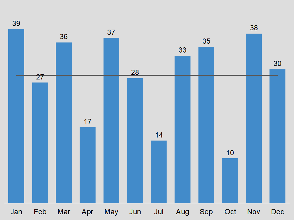
Target line
Overall, a target line represents a goal or a particular measuring point. So, your target may represent a monetary goal. For example, you may want to analyze how many items or groups meet or exceed the target of 36 dollars. Of course, you also want to see ones that fall below the target.
Sometimes, you may want to set the target as the average, median, or some other statistical measure. In any case, the video below will show you how to place an average or target line in your chart.
Short video
Below is the short video on adding an average line to a column chart in Excel. By the way, we do not use any funky tricks or chart manipulation. Additionally, you may need to maximize the video, to get the full effect of this quick tip.
Download
If you are interested in downloading this type of chart, then visit the link below.
Column chart with average line for Excel