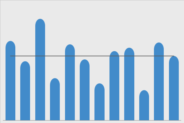
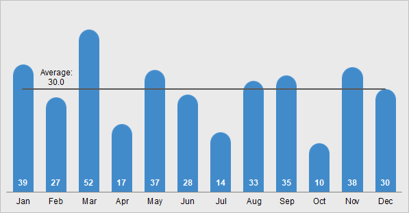
The rounded column chart with average line is very similar to our column with average line chart. Basically, it shows data across categories. In addition, the average line shows the central tendency of the values. Moreover, you can visually view which categories are above or below average.
Adjusting the Rounded Top
Now, depending on the value of your column, the rounded top may change. For example, if you enter a high value, then the rounded top may appear flatter. And, if you enter a low value, then the rounded top may appear rounder.
To fix that, simply change the value in column C.
Download the Rounded Column Chart
Click on the button below to download this graph.
Requirements: Microsoft Excel 2007 or higher or compatible.
Related Topics
Questions or Comments
If you have any questions or comments, then us at info@exceleffects.com.