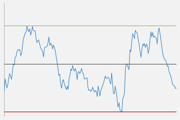
Scatter line chart with key stat lines for Excel
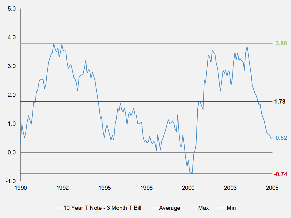
The scatter line chart allows you to measure data in both directions, horizontally and vertically. Or, on an x/y scale. This kind of chart gives you more formatting options from a regular line chart. Overall, this chart is very popular in financial firms, particularly, investment banks.
Requirements
Microsoft Excel 2007 or higher or compatible.