Pill Bar overview
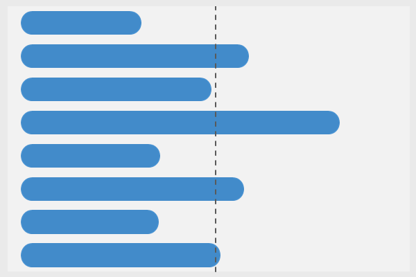
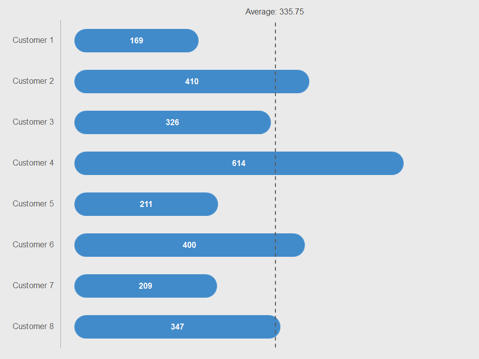
The pill bar with average line chart is similar to a regular bar chart. Instead, with this chart, the two endpoints are round. Thus, you get what looks like a pill. Of course, as with the bar chart, this chart is shows everything in a horizontal manner. Now, with all that said, this is still 100% Excel. That is the key. Essentially, you really need to do is update the numbers and watch the chart work.
The trick
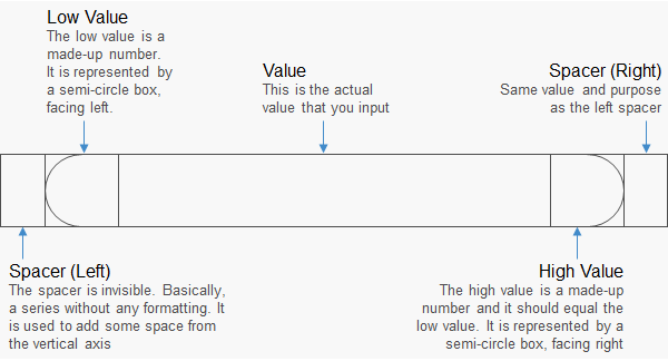
So, what is the trick? There is no real trick. However, we do some things to a regular stacked bar chart. Basically, the each pill contains five bars. An illustration of these five bars is shown below.
Requirements
Microsoft Excel 2007 or higher or compatible.
Click on the button below to download this chart.