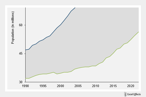
Area difference chart in Excel
The area difference chart is kind of unique. Essentially, this version combines a line and stacked area chart.
Learn more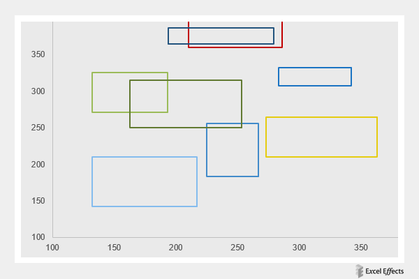
Box chart
We must say, the box chart is truly a unique data tool. If you are building a graph natively, then you will not find this type in your options.
Learn more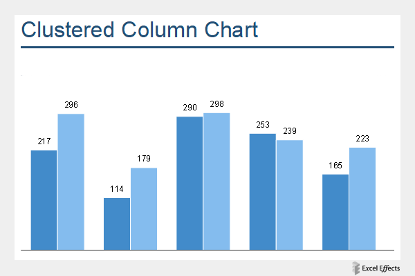
Clustered column chart
The clustered column chart is very similar to the standard column. Instead, it has additional columns, side-by-side, forming a cluster.
Learn more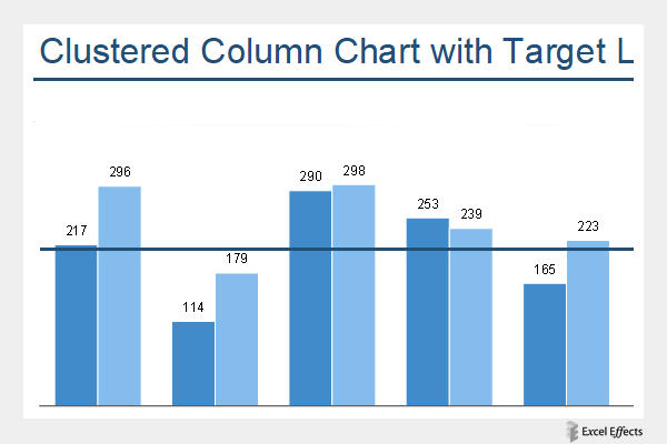
Clustered column chart with target line
The clustered column chart with target line allows you to compare multiple series to a particular goal.
Learn more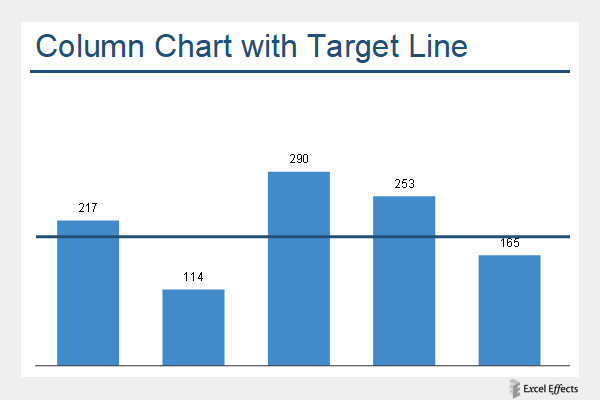
Column chart with target line
The column chart with target line is great for viewing which items meet, exceed, or fall below a particular goal.
Learn more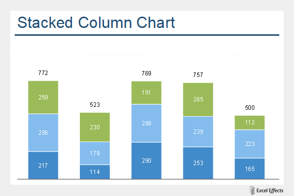
Stacked column chart
The stacked column chart allows you to compare items as part of a whole. In this tool that we have for you, there are three parts.
Learn more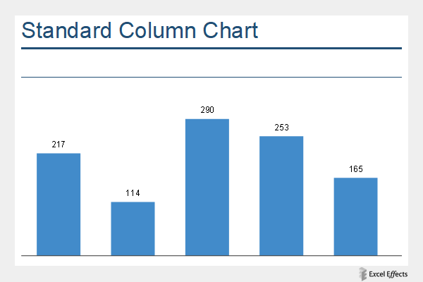
Standard column chart
The standard column chart is very common in almost every industry, including education.
Learn more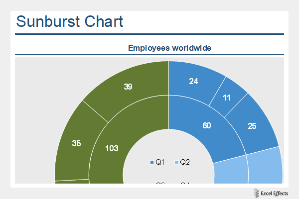
Sunburst chart
The sunburst chart is a creative way to show parts of a whole in a circular fashion.
Learn more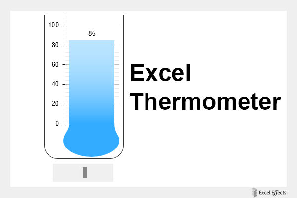
Thermometer experiment in Excel
So, we came up with the idea of creating a nice thermometer in Excel. Honestly, we surprise ourselves with these creations.
Learn more