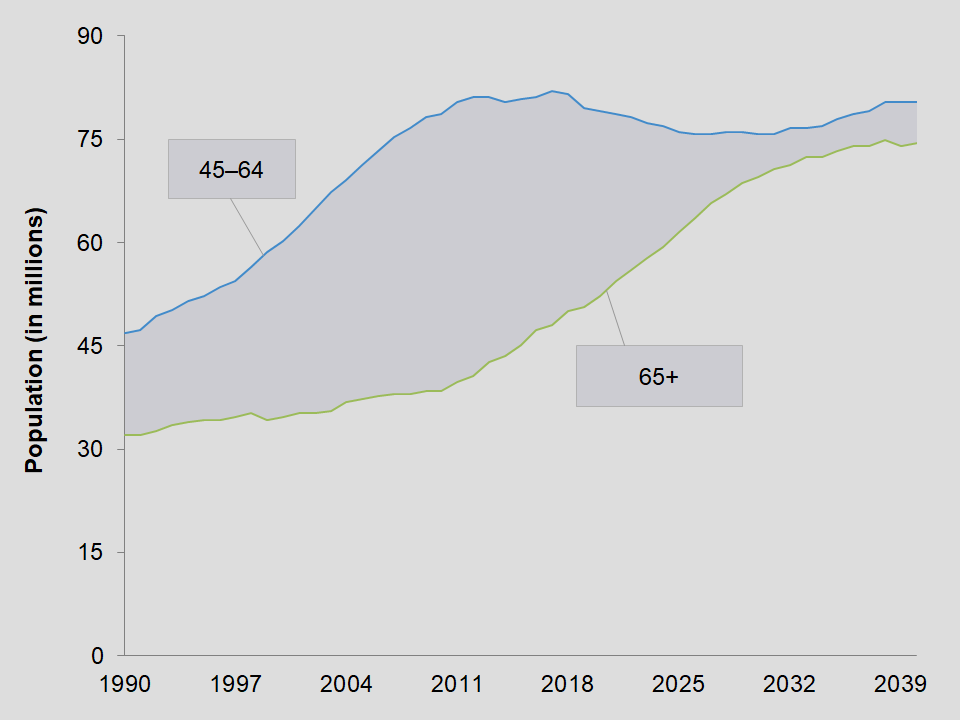
Area difference line charts shades the portion between two series of lines. We did this chart in Excel. But, it should run in any applicate that is compatible with Excel.
Overview of area difference line chart
So, this type of chart is a combination of two graphs. Firstly, we have a line chart. Secondly, there is a stacked area chart. At first, we thought the two different types would not work. However, it turned out great for what we were trying to do.
Working the chart
Overall, working with this chart is not that difficult. Some combination charts are tricky to use and create. But, we try to make them easy for you.
This particular chart works with years for the x-axis. For the most part, you may want to keep it as years, as we did not test it for any other form of data. On the other hand, feel free to experiment too. See what works.
The only data you have to enter are the numbers for the two lines. After that, the shaded portion is automatically calculated. All you have to do is adjust the ranges for each series.
Download
If you want to download this chart, then click on the button below.
Download
Size: 15.1 kilobytes